
21 Instagram Grid Ideas
Here is the uncomfortable truth: nobody follows an account because nine thumbnails match perfectly. People follow because the account promises something they want: better outfits, smarter advice, useful products, a point of view, a life they are curious about.
LikeWave Team
Published · Updated
So why care about the grid at all? Because before a visitor follows you, they usually inspect the profile. Your Instagram grid is the lobby. It does not need to be a museum. It needs to make the next step obvious.
If you came here looking for one Instagram grid idea, start with the flexible brand rhythm. It is the safest choice for most creators and businesses because it looks intentional without forcing every future post into a visual prison. If you want more options, this guide compares 21 Instagram grid ideas by effort, flexibility, and business goal.
What Is the Best Instagram Grid Idea in 2026?
The best Instagram grid idea for most accounts is a flexible three-post rhythm: one human or lifestyle image, one useful carousel, and one product, result, or proof post. Repeat the content rhythm, not an identical design. Use consistent colors, type, and cover placement to connect the posts.
This layout works because every post can still make sense in the home feed, while the profile grid feels organized. That balance matters more than a complicated puzzle that only looks good when all nine pieces are visible.
The Instagram Grid Changed. Your Strategy Should Too.
The old advice was simple: make square posts, pick a filter, arrange a pretty 3-by-3 puzzle, and never break the pattern. It was good advice for an Instagram that no longer exists.
Profile previews are now taller, vertical content dominates the app, and Instagram has introduced the ability to reorder posts on the main profile grid. That last change is bigger than it sounds. Chronology no longer has to dictate your storefront. You can bring an old case study back to the first row, group a series together, or rebuild the visual story without deleting posts and losing their engagement.
But do not misunderstand the opportunity. A beautiful profile does not rescue weak content. The grid influences profile conversion; the individual post still has to earn attention, saves, shares, comments, clicks, and follows on its own.
The new rule: design every post for the feed first and the grid second.
Instagram Grid Ideas: Quick Comparison
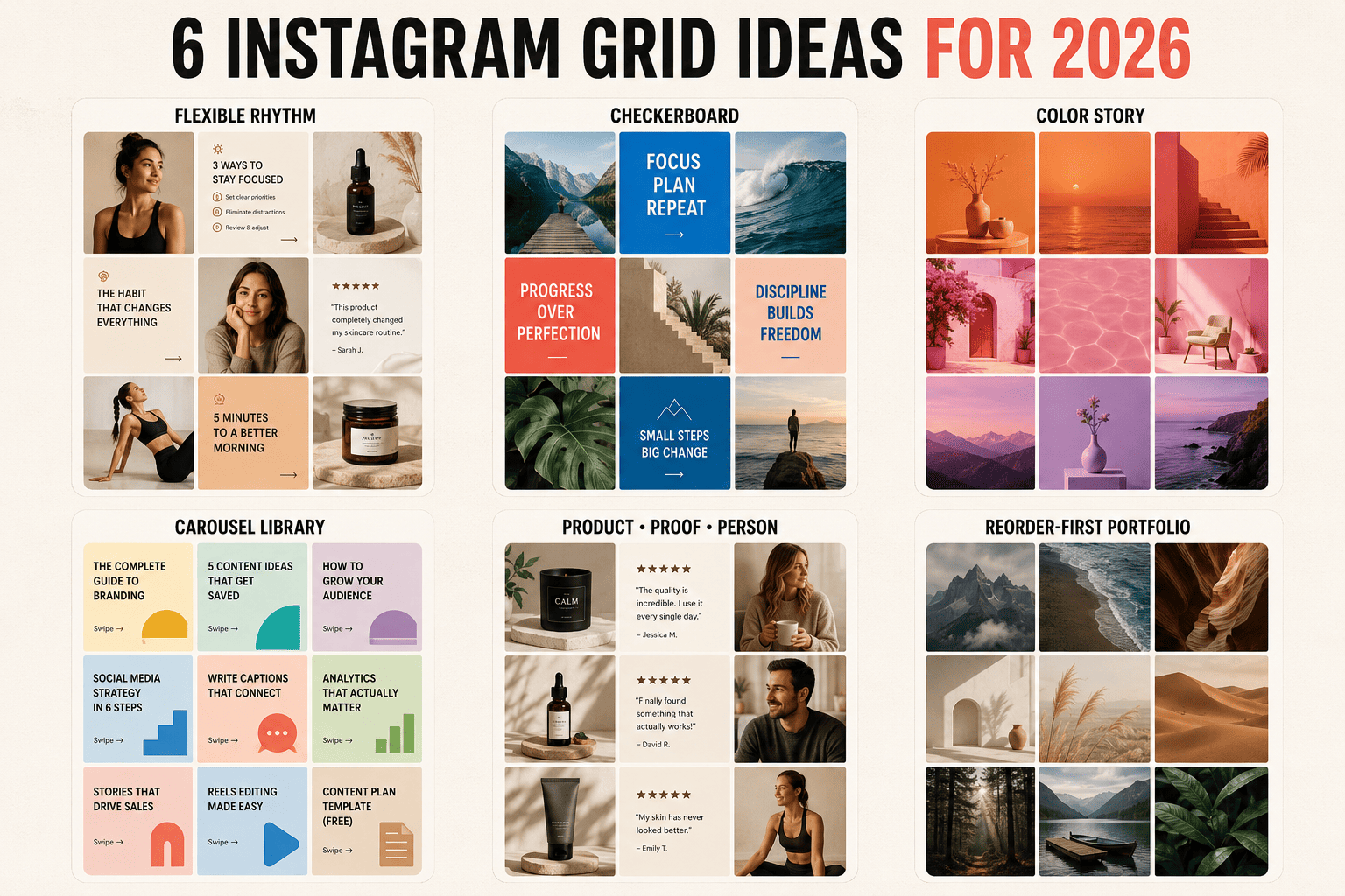
Instagram grid idea Best for Effort Flexibility Main risk Flexible brand rhythm Most brands and creators Low High Can feel generic without a strong point of view Checkerboard Educational and service accounts Medium Medium Too many quote tiles Three content pillars Experts and media brands Low High Columns shift if the rhythm breaks Row-by-row story Campaigns and launches Medium Medium Requires batches of three Color story Fashion, travel, food Medium High Color can overpower the message Puzzle grid Short launches and art projects High Low Weak standalone posts Reorder-first portfolio Photographers and designers Medium High Needs regular curation
21 Instagram Grid Ideas Worth Trying
1. The Flexible Brand Rhythm
Best for: almost any business, personal brand, or creator who needs to post consistently.
Rotate three jobs: connect, teach, prove. Post a face, story, or behind-the-scenes image; then a useful carousel; then a product, testimonial, transformation, or result. Keep two fonts, a small color palette, and one cover system.
The beauty is not in rigid placement. It is in recognition. Visitors quickly see who you are, what you know, and why they should trust you. Miss a day? Publish a Reel? Change the campaign? Nothing collapses.
Use it like this: portrait → tutorial carousel → client result. Then repeat with different subjects and compositions.
2. The Checkerboard Grid
Best for: consultants, coaches, agencies, and educational creators.
Alternate between two recognizable formats: photo and graphic, dark and light, question and answer, person and product. The A-B-A-B rhythm creates order with very little design work.
The trap is filling every graphic tile with a motivational quote nobody asked for. Make the graphic useful: a sharp claim, a checklist, a number, a before-and-after, or the first slide of a carousel.
Practical rule: the difference between A and B should be visible at thumbnail size, but both should clearly belong to the same brand.
3. The Three Content Pillars Grid
Best for: experts, publishers, educators, and multi-service companies.
Give each recurring slot a job. For example: opinion, how-to, case study. Or product, customer, lifestyle. The profile becomes a simple editorial system instead of a pile of unrelated posts.
You can maintain literal vertical columns, but you no longer have to. With grid reordering, you can group the strongest examples near the top after publishing. The content architecture matters more than geometric perfection.
Question to ask: if someone sees only the first six posts, can they name your three themes?
4. The Row-by-Row Story
Best for: launches, travel diaries, collections, events, and episodic content.
Use each horizontal row to tell one small story. A fashion brand might show the full look, a material detail, and the product in motion. A restaurant could show the ingredient, the kitchen, and the finished plate.
This layout rewards people who visit the profile, but it creates a production rule: you need three related posts. If publishing them together would annoy followers, space them out and reorder the grid later.
5. The Evolving Color Story
Best for: travel, beauty, interiors, food, fashion, and photography.
Do not trap the account inside one permanent beige filter. Move gradually from one dominant color to another: sand to amber, amber to red, red to violet. The transitions make the grid feel alive while consistent editing ties it together.
The best version uses color as a supporting actor. Skin should still look human. Food should still look edible. A blue preset is not a brand strategy.
6. The Editorial Cover System
Best for: news pages, B2B brands, podcasts, and thought leaders.
Treat key posts like magazine covers. Use one strong image, a short headline, a fixed text area, and a small category label. Vary the subject and color while preserving the hierarchy.
This makes complex topics easy to scan. It also forces better writing. If you cannot explain the reason to open a carousel in six words, the grid is exposing a content problem, not a design problem.
7. Product, Proof, Person
Best for: e-commerce, local businesses, SaaS, and service companies.
Rotate a product or service post, evidence that it works, and a human story. Product explains the offer. Proof removes doubt. Person gives the account a pulse.
This Instagram feed layout is built for conversion rather than decoration. It also solves a common brand problem: a feed full of products feels like a catalog, while a feed full of lifestyle images never explains what is being sold.
8. The Negative-Space Grid
Best for: luxury, architecture, skincare, jewelry, and minimalist brands.
Give each subject room. Use clean backgrounds, controlled compositions, and fewer visual elements. Consistency comes from spacing rather than identical templates.
This looks expensive when the photography is good and empty when it is not. Negative space magnifies every detail: lighting, shadow, crop, typography, and product styling. There is nowhere for weak execution to hide.
9. The UGC and Brand Hybrid
Best for: consumer products, hospitality, fitness, and communities.
Mix polished brand content with customer images, reviews, screenshots, or creator collaborations. Unify them with consistent crops, subtle borders, or a recurring cover label instead of heavily editing away their authenticity.
A feed made entirely by the brand says, “Look what we sell.” A hybrid says, “Look who already chose us.” That second message is usually stronger.
10. The Carousel Library
Best for: educators, marketers, financial creators, and technical experts.
Build a cover system that turns the profile into a searchable visual library. Give each topic a category color, write benefit-led headlines, and number recurring series.
Avoid making every cover identical. Keep the brand frame but vary the image, scale, headline length, and color balance. Recognition is useful. Monotony is not.
Strong cover: “7 Hooks That Earn the Second Slide.” Weak cover: “Marketing Tips #14.”
11. The Reels-First Thumbnail Grid
Best for: video creators, entertainers, educators, and personal brands.
Your content is video, but your profile is still scanned as thumbnails. Design Reel covers with a clear face or object, a short promise, and enough breathing room for the vertical preview crop.
Do not use a random video frame unless it is genuinely compelling. And do not put a paragraph on the cover. The thumbnail has one job: help the visitor decide what to watch next.
12. Monochrome With One Accent Color
Best for: artists, musicians, fashion labels, and bold personal brands.
Use black and white or a tightly desaturated palette, then reserve one vivid color for calls to action, product details, or recurring themes. The accent becomes a visual signal rather than decoration.
Choose the accent for a reason. Red might mark opinions. Yellow might mark tutorials. Electric blue might mark product news. A system is memorable; random color is just random color.
13. The Raw-and-Polished Mix
Best for: founders, artists, restaurants, and lifestyle creators.
Alternate finished work with process: campaign image, phone snapshot, final product, messy desk, professional portrait, screenshot of the first draft. The contrast creates narrative tension and makes polished work feel earned.
“Authentic” does not mean careless. A candid image still needs a clear subject. A rough video still needs a reason to watch. Show reality, not visual noise.
14. The Before, Process, After Grid
Best for: fitness, beauty, design, renovation, education, and agencies.
Build rows or mini-series around transformation. The first post shows the starting point, the second explains what happened, and the third reveals the result.
This is a grid idea with a built-in story, but credibility matters. State time frames. Explain conditions. Avoid exaggerated claims. The process post is often the most valuable because it proves the result did not appear by magic.
15. Seasonal Content Blocks
Best for: retail, food, travel, events, and local businesses.
Let campaigns occupy six or nine posts with a distinct palette and message, then transition. Your profile becomes a timeline of brand chapters rather than one endless visual template.
Use the reorder feature to keep the strongest campaign assets together and move expired offers away from the top. A seasonal grid should feel current, not like a shop window that still says Christmas in March.
16. The Three-Post Triptych
Best for: product drops, album releases, events, and major announcements.
Spread one concept across three posts: image, statement, image; wide scene, hero object, close-up; problem, idea, result. Unlike a nine-tile puzzle, each piece can remain meaningful in the feed.
Use this as punctuation, not the entire language of the account. A triptych feels special because it interrupts the usual rhythm.
17. The Puzzle Grid—Used Once, Not Forever
Best for: account launches, art projects, and short visual campaigns.
One large image is divided across six or nine posts. It can make a dramatic profile view. It can also produce eight confusing fragments in followers’ home feeds.
If you use a puzzle, design each tile to stand alone. Give every segment a subject, useful caption, or carousel behind it. Then group the set with grid reordering after the posts are live.
Verdict: spectacular for a moment, exhausting as a permanent strategy.
18. The Diagonal Echo
Best for: design-led accounts that enjoy planning.
Repeat a recognizable visual diagonally: a text card, circular portrait, product on white, or signature color. The eye discovers the pattern while the rest of the feed remains varied.
This is subtler than a checkerboard and less forgiving. Preview at least nine posts before committing, and do not sacrifice a timely piece of content merely to preserve a diagonal line.
19. The Community Mosaic
Best for: membership brands, events, universities, nonprofits, and fan communities.
Feature different people in a consistent portrait or testimonial format. The repeated frame unifies the feed; the changing faces provide energy. Add names, roles, locations, or one-line stories to make every tile specific.
This is one of the few Instagram grid ideas where variety is the identity. The brand becomes the community it gathers.
20. The Reorder-First Portfolio
Best for: photographers, designers, stylists, architects, and freelancers.
Publish work when it is ready. Then curate the top of the grid like a portfolio: strongest project first, complementary colors nearby, three examples of your priority service, and recent work supporting older classics.
This strategy finally separates publishing order from presentation order. Review the top 12 posts once a month. Ask whether they represent the work you want next, not merely the work you did last.
21. No Visible Pattern—Just Strong Art Direction
Best for: confident brands and creators with varied content.
Here is the grid idea many template sellers will not give you: stop building a pattern. Use consistent taste instead. Repeat photographic choices, voice, subject matter, contrast, and emotional tone without forcing tiles into fixed positions.
The result looks less “planned” and more authored. It is harder because there is no template to blame. But when it works, the profile feels like a person or brand with a worldview rather than a Canva folder.
How to Choose the Right Instagram Grid Layout
Do not ask, “Which grid is prettiest?” Ask three less glamorous questions.
What must a visitor understand? If you sell expertise, prioritize clear carousel covers and proof. If you sell taste, prioritize photography and art direction. If you sell a physical product, show the product, the person using it, and evidence that people value it.
How often can you realistically publish? A row-by-row grid asks for content in threes. A puzzle asks for a complete campaign before post one. A flexible rhythm can survive a chaotic week.
Can every post succeed alone? Followers encounter posts individually. If a tile only makes sense inside the profile, redesign it.
Now choose the simplest format that answers all three. Simplicity is not a lack of ambition. It is what makes the system usable after the initial excitement is gone.
A Simple Nine-Post Instagram Grid Plan
If your account looks inconsistent today, do not delete everything. Plan the next nine posts with this structure:
Post Content Purpose 1Your strongest useful ideaEarn a save or share 2A human story or behind the scenesBuild connection 3A product, service, or offer in contextExplain what you do 4A customer result, review, or case studyBuild trust 5A strong opinion about your nicheCreate distinction 6A practical tutorialDemonstrate expertise 7A customer, community member, or collaboratorAdd social proof 8Your origin, process, or valuesGive context 9A clear next stepDrive a click, inquiry, visit, or purchase
Use two cover styles and a consistent photo treatment across all nine. When the set is live, reorder it so the first row answers three questions: Who is this for? Why should I care? What should I do next?
Instagram Grid Size and Safe-Zone Rules for 2026
Instagram’s current guidance accepts photos at a width of at least 1080 pixels and an aspect ratio between 1.91:1 and 3:4. For new static designs intended to use the taller format, work at 1080 × 1440 pixels (3:4). You can verify the supported range in the Instagram Help Center.
Many existing templates are 1080 × 1350 pixels (4:5). They are not the same as 3:4: 1080 × 1350 is 4:5, while 1080 × 1440 is 3:4. Both may appear around the platform and inside older workflows, so always preview your real profile rather than trusting a template label.
Keep headlines, faces, logos, and product details away from the outer edges.
For Reel covers, keep the essential subject near the center because the full 9:16 cover and the profile preview do not show the same area.
Check the first carousel slide at actual thumbnail size. If the headline needs zooming, it is too small.
Use Instagram’s preview adjustment when a photo or cover crops badly.
Before a puzzle or triptych, test the finished arrangement inside a grid planner or private mockup.
Seven Instagram Grid Mistakes to Avoid
Making filler posts for the pattern. A blank tile may complete the checkerboard, but followers receive a post with no value.
Writing tiny headlines. Your design file is large; the profile preview is not.
Building a puzzle that fails in the home feed. Nobody wants to engage with the upper-left corner of a forehead.
Using one template for every idea. Consistency should help recognition, not flatten every message into the same shape.
Copying an aesthetic that contradicts the offer. A playful candy-colored grid may be fashionable and still be wrong for a serious legal service.
Optimizing beauty instead of clarity. Visitors should know what the account offers before they admire the palette.
Refusing to break the grid. If a timely, useful post does not match the plan, publish it anyway. The strategy works for the content, not the other way around.
How to Know Whether Your Instagram Grid Works
Do not judge the redesign by asking three friends whether it looks nice. Track the behavior that happens after someone visits the profile.
Profile visits to follows: divide follows attributed to the period by profile visits and compare before and after the redesign.
Profile visits to website taps: useful for service, e-commerce, and lead-generation accounts.
Pinned and top-row post opens: check whether the posts you made prominent actually earn attention.
Saves and shares per reach: these reveal whether the individual content works beyond the profile.
Production time: if the layout adds six hours a week and produces no meaningful lift, it is not a system. It is a hobby.
Give the new layout enough time to collect a reasonable sample. Compare a full content cycle, not one good Tuesday against one bad Friday. Then keep the parts that improve clarity and remove the parts that exist only to impress other social media managers.
Frequently Asked Questions About Instagram Grid Ideas
What is an Instagram grid?
An Instagram grid is the collection of post and Reel thumbnails displayed on a profile. The order, colors, covers, subjects, and repeated visual choices create the overall appearance of the account.
What is the easiest Instagram grid idea?
The easiest sustainable idea is a flexible three-post content rhythm: human or lifestyle content, useful educational content, and product or proof content. Use consistent fonts and colors, but do not require exact tile positions.
Are Instagram grids still important in 2026?
Yes, but mainly for profile conversion and brand clarity. A grid can help a visitor understand and trust an account, but it does not replace strong individual posts or guarantee greater reach.
Can you rearrange your Instagram grid?
Instagram has rolled out grid reordering in its mobile apps. On supported accounts, go to your profile, press and hold a post, choose the reorder option, and drag content into place. Pinned posts remain at the top. If the option is missing, update the app and check again because feature availability can still vary by account or rollout.
What is the best Instagram grid idea for a business?
For most businesses, use the product-proof-person layout. It balances what you sell, evidence that it works, and the humans behind or using it. Service businesses can substitute educational carousels for product posts.
What is the best Instagram grid idea for a personal account?
Use an evolving color story or a no-pattern grid with consistent art direction. Repeat a few choices—editing, perspective, tone, and subject matter—while leaving enough freedom to post real life.
Should I use a puzzle grid?
Use a puzzle grid for a launch or short art project, not as your default content system. Make sure every tile is meaningful on its own because most followers will encounter each post separately.
How many posts should I plan in advance?
Plan at least nine thumbnails to evaluate the profile view, but keep the publishing schedule flexible. For simple brand rhythms, three to six prepared posts may be enough. Puzzle and row-based layouts require the complete set before publishing.
Does an aesthetic Instagram grid increase engagement?
Not automatically. A clear grid may improve the percentage of profile visitors who follow or click, but post-level engagement depends on the idea, hook, creative execution, relevance, and audience response.
The Final Test
Open your profile and cover the username. Look at the first nine posts for five seconds.
Can you tell who the account is for? Can you tell what it repeatedly offers? Is there one post you immediately want to open?
If the answer is yes, the grid works. If the answer is no, another preset will not save it. Choose a clearer content rhythm, give every post a job, and start with the next one.